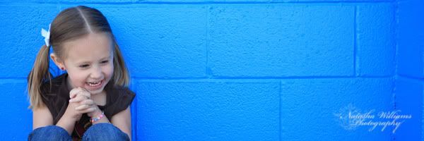
I think this works for the "graphic" theme because of the way it is framed and the colors. I loved this one anyway!
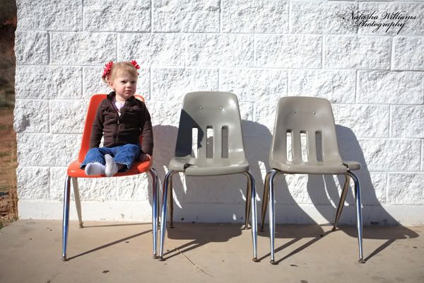
Shh... don't tell, but I'm kinda cheating on this day. I've been so sick the last few days with a head cold and had no desire to leave the house all day, so this one was actually taken the day after.
I LOVED the color of these chairs and set them up like this for this look. I could have had them all be the same color, but I liked that I had only one orange one in the picture. I also liked the white background to make it simple. I was going to crop out the edge of the building, but in the end I liked that it added a little something.

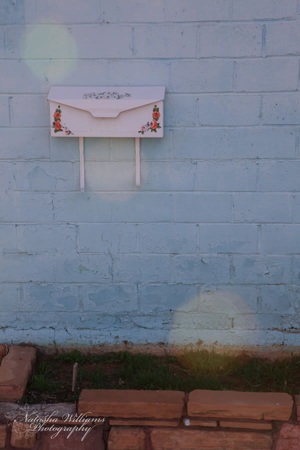
So I took a bunch of pictures today but either I didn't like them enough or I didn't think they fit the "lines" theme. This one I'm just going to make it fit my theme. How? Well, here's my explaination... There's defintitely some horizontal lines in it, not as prominent as I was thinking for this subject, but the "line" that really draws me through this picture is the dots going diagonally through it. I know it's not an actual line, but as far as this picture goes composition wise, I think the dots draw your eye through it in a pleasing way. But really, I just liked the picture, so even if it doesn't totally work for the theme, I'm using it for today anyway!
Ya know, maybe I like it so much because it reminds me of my first house! It was turquoise (much brighter than this one) and it had a cute little mail box by the front door, much like this one, but without the cute floral decoration. Sadly, our old house is no longer that bright, fun color, the current owners repainted it after we sold it... now it's just boring brown! I liked the old charm!
